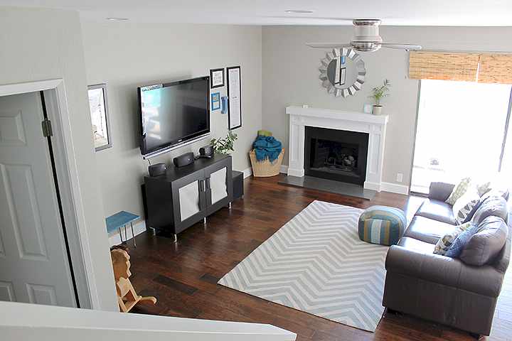
These pictures aren’t too great, but my cousin Sarah has been begging to see our house! Today I thought I’d start with the living room and dining room, since those are the only areas that are actually clean. ;)
Our house is small, clocking at only 1500 square feet. But we got space exactly where we needed it, and didn’t want or need anything much bigger. Our family is small and I hate to clean, so the less space the better! 1500 seems manageable to us – if we ever let it get too bad, it only takes us an hour or two on a Saturday morning to clean and whip our entire house back into shape.
We looked at larger houses that weren’t as functional or needed more work than we wanted to do, and ultimately decided this space is perfect for our family. It’s a fantastic open layout and the previous homeowners made excellent choices when they renovated. The entire house is modern (we’re not much for traditional design, Tyler and I) and in beautiful neutral tones of grey. There are still little projects here and there that we have been tackling, but it’s nice because we don’t feel like we have to spend every single Saturday at Lowes.
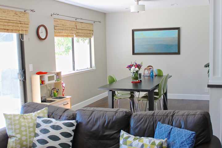
The downstairs is actually a wee bit smaller than the upstairs, but the layout is really open and bright. We have a large kitchen, a living room, a dining room, and a half bath. We love the deep Harry Potter closet (under the stairs) for hiding Jack’s toys and puzzles when he’s not using them.
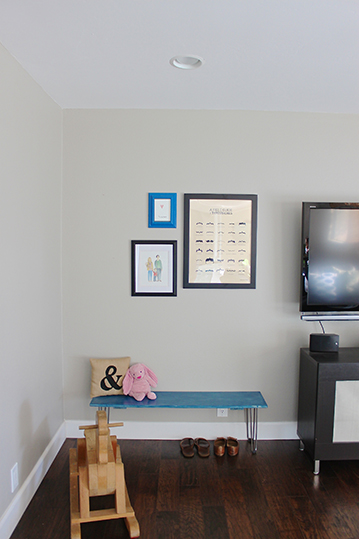
The only tricky thing about the downstairs is the layout of the family room; we’re finding it difficult to add extra seating. We’ve added a bench in the corner (see below) and we pull in chairs from the dining room when we have guests, but we haven’t come up with a long-term solution. We’re not sure a bigger couch would fit, or if we even want a larger couch at all. But again, it’s perfect for us right now.
Our sliding door is large, and lets in quite a bit of natural light along the back wall of our house. I love to have it open all day when we’re home, as it lets in a nice ocean breeze. We don’t have the typical backyard – instead we have a large patio with a greenspace behind it. We find the greenspace is excellent for getting wiggles out, bug hunting, and the occasional picnic or preschool lesson. (We’ve also hosted a Ginos family dinner out there!) Long-term I think I’d like to add a picnic table or large sectional sofa to our patio so we can eat dinner out there in the evenings. We’ve planted a garden along one side, which has been fun for Jack to take care of every day.
I’ll tackle the kitchen (my favorite!) in another post. We weren’t home most of the weekend so it became a dumping spot and just needs to be cleaned up before I can take pictures. :)


So cute!!! I love it!!!
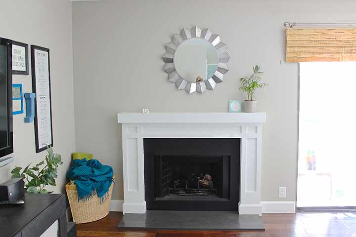
Oh my gosh. I’m in love! Its beautiful!! I love the fireplace, the bamboo shades, the door!! I love the colors, and I love how you’ve styled it. Im obsessed! I need you to come help me!!
So simple, so chic! What a a beautiful space.
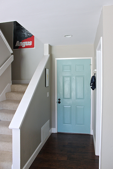
came across your blog and had to comment on how beautiful your living|dining room is :) i love all the colors!! would you mind sharing the wall and front door color?!
Hi Jessica! Thanks so much! Our wall color came with the house – I wish I had an answer for you other than the paint cans are labeled with the words “stormy weather”. I don’t even know the brand, but with a quick google I’m fairly certain it’s Olympic (http://www.olympic.com/color/paint-colors/stormy-weather-d16-3). Our front door, however, is Valspar’s Lake Country in semi-gloss.