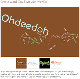
One of my favorite blogs, Ohdeedoh, recently posted this, and I found it rather upsetting. It’s kind of insulting to graphic designers. We put a lot of time and effort into what we do, and it actually looks good…whereas these look like crap. I’m not saying by any means that my own design work is perfect, but these are kind of over-the-top ugly, with their terrible font choices and bad layouts.
I can do better than that. We have entire classes that teach just typography. And just poster design. Ten minutes on wordle.net isn’t enough to compete, in my opinion.
I kind of see what they’re getting at, trying to bring art to the masses, but they’re all just ugly. Would you use these as wrapping paper? Some jobs should just be left up to the trained professionals, perhaps?


Leave a Reply